Codefresh - Web Page Refresh
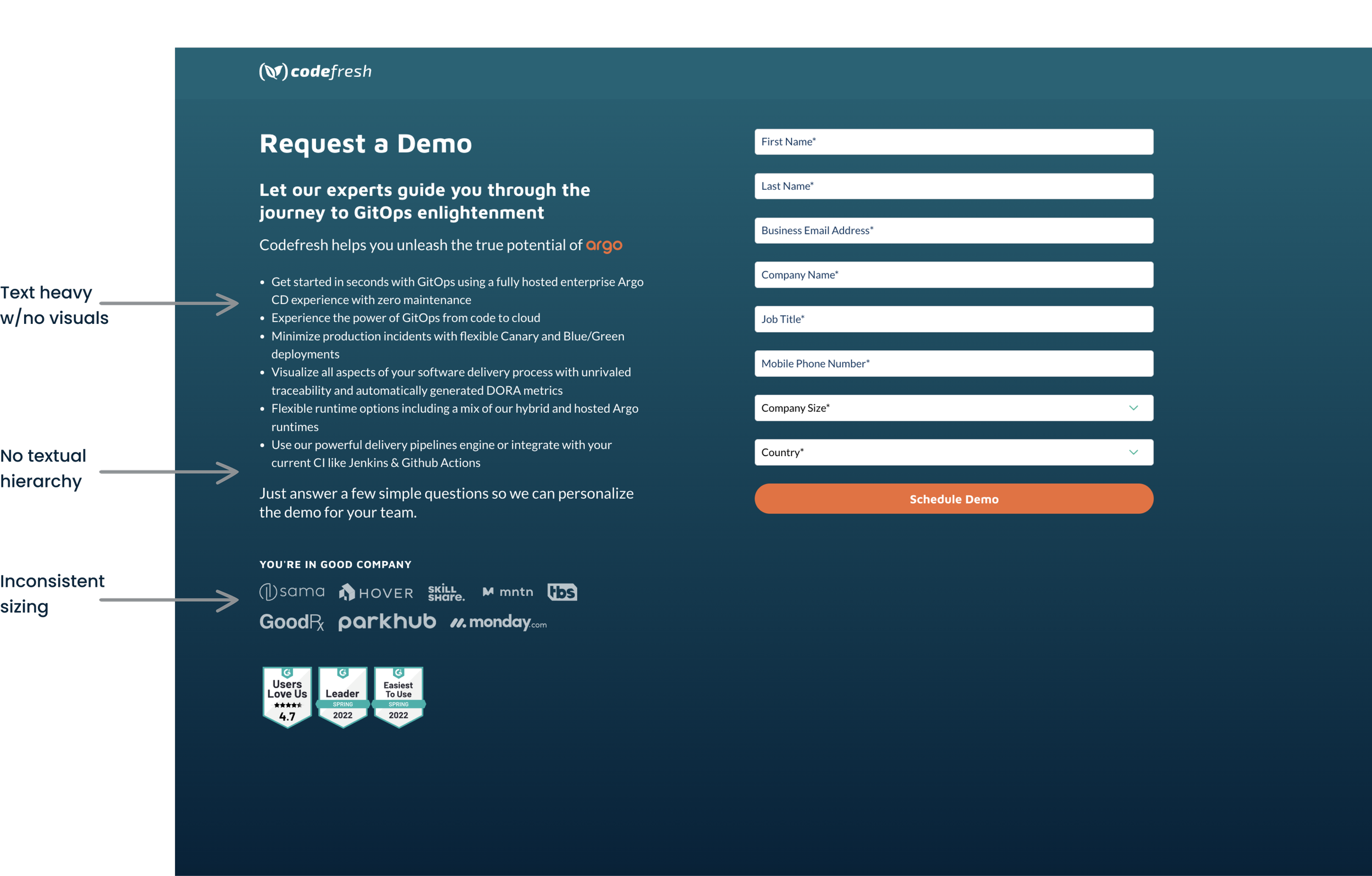
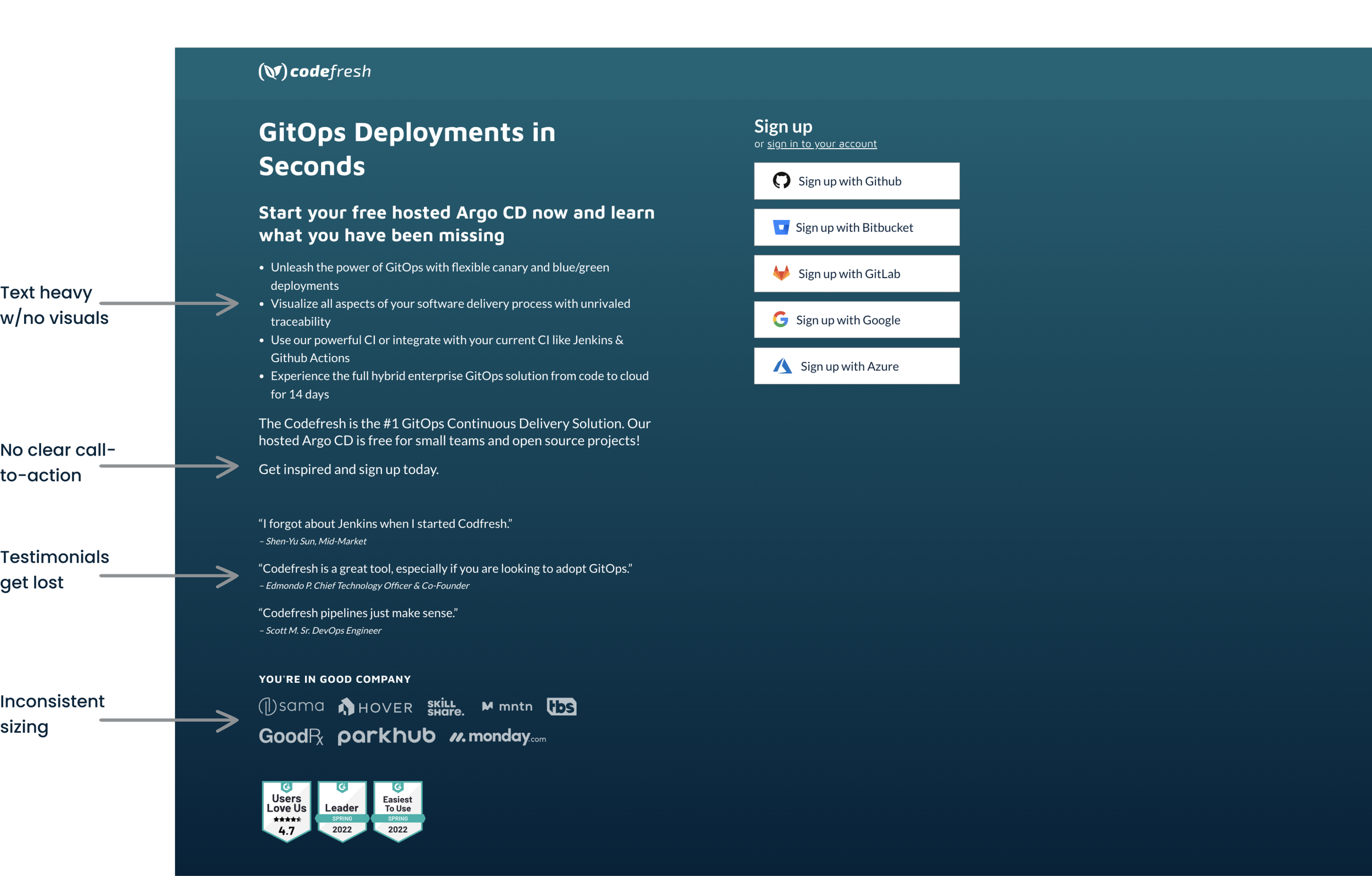
I was tasked with refreshing Codefresh’s high-traffic web pages, specifically the signup and demo pages. Initially, these pages were very text-heavy, lacked visual elements, and were missing any sort of branding. These pages also felt very dissimilar from the rest of the site.
Bring on the challenge!
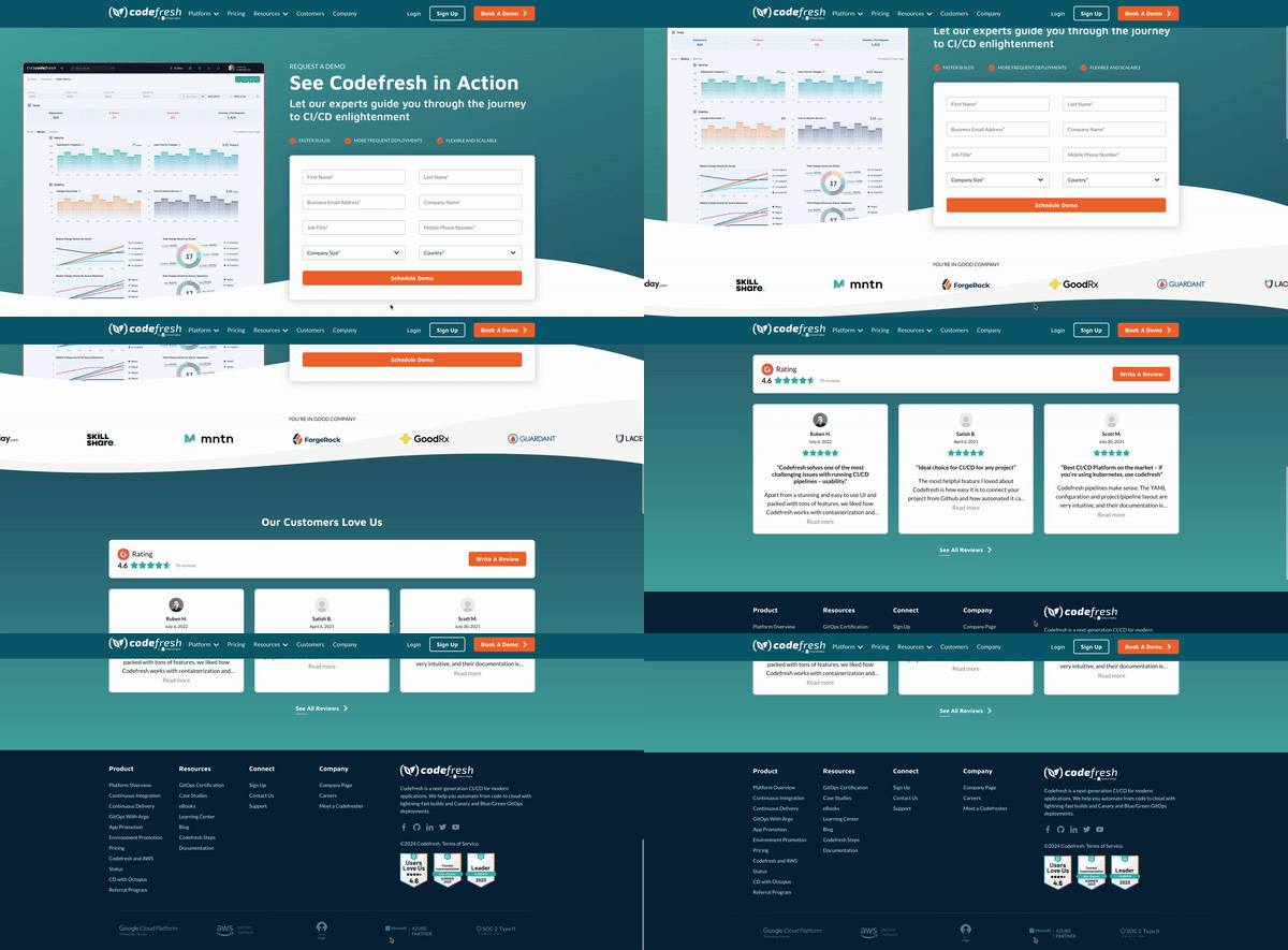
For the demo page, I aimed to incorporate the product dashboard to give prospective clients a "sneak peek" of what they'll be demoing. This visual element not only breaks up the text but also makes the page more engaging and easier to digest. I kept the text concise and added icons, like checkboxes, to convey key points effectively.
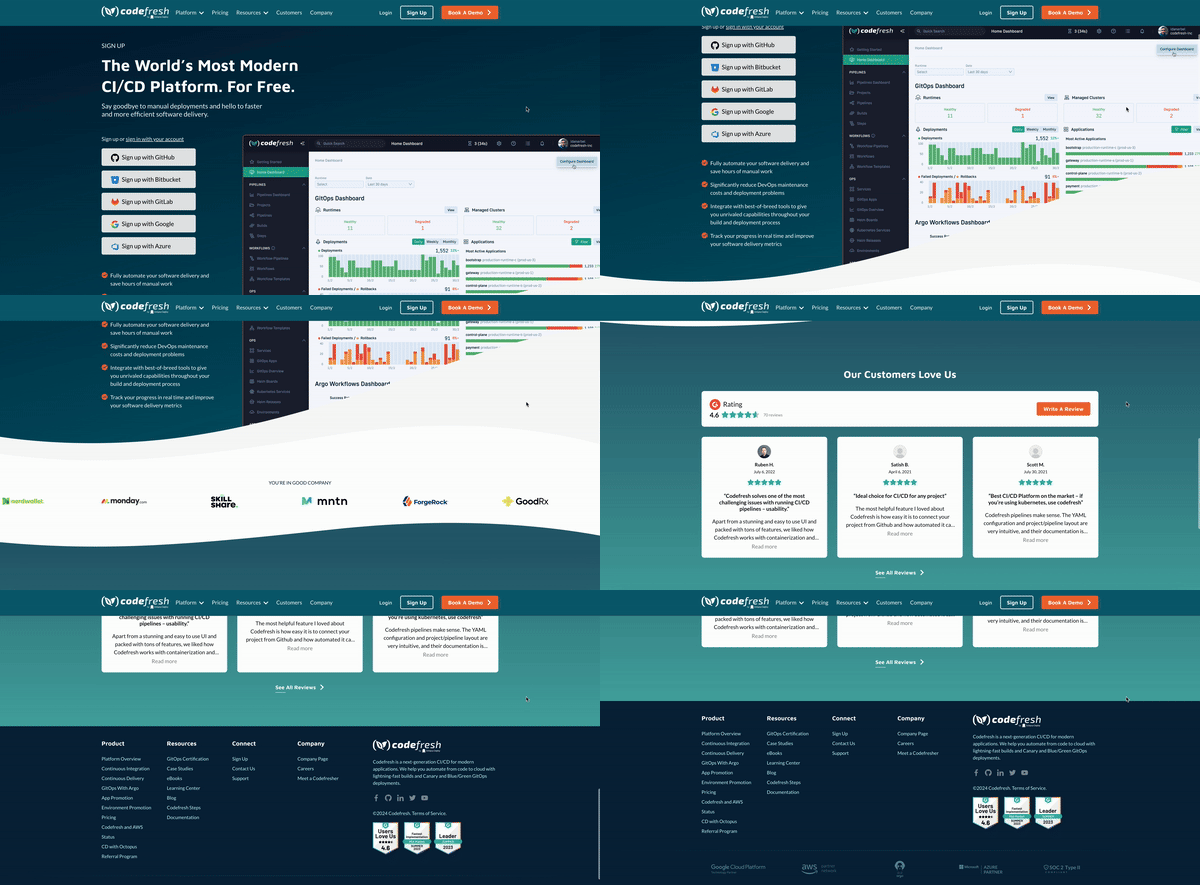
For the signup page, I carried over the same visual theme from the demo page to ensure a cohesive user experience across both. Both pages incorporate consistent brand elements, such as colors, typography, and imagery, to reinforce brand recognition and create a seamless transition between pages. To enhance credibility and build trust, I made the testimonials more prominent by placing them in a dedicated section and also highlighted the logos of companies that use Codefresh, without overwhelming the page. Subtle visual cues and spacing were also utilized to create a balanced layout that directs users' attention to key areas, ensuring an intuitive and efficient signup experience.


