

App Feedback Modal - Native App Design
About the Company
HomeLight is a real estate technology platform designed to streamline the home buying and selling process. It connects users with top real estate agents based on their location, providing data-driven recommendations for agents who are best suited to their needs. HomeLight’s platform analyzes millions of transactions to match clients with experienced agents, ensuring optimal results whether they are buying, selling, or both.
Problem
The HomeLight app had a rating of 3.2 in the Apple App Store and 3.1 in the Google Play Store, with many of the reviews being outdated and predominately negative.
How can we increase our rating and receive more reviews?
Role
Product Designer and Product Manager
Users
Agents who use the HomeLight app
Tools Used
Figma and UserTesting.com

Ideation
When researching and ideating a feedback modal for mobile, the first step is understanding user behavior and the moments when feedback is most valuable. Doing some competitor analysis helps us evaluate existing solutions, while focusing on designing a modal that is simple, non-intrusive, and accessible, ensuring it’s easy to dismiss or complete quickly. Key considerations include the tone of messaging, timing of prompts (such as after key milestones or positive interactions), and optimizing the design for thumb reach and mobile UI best practices.
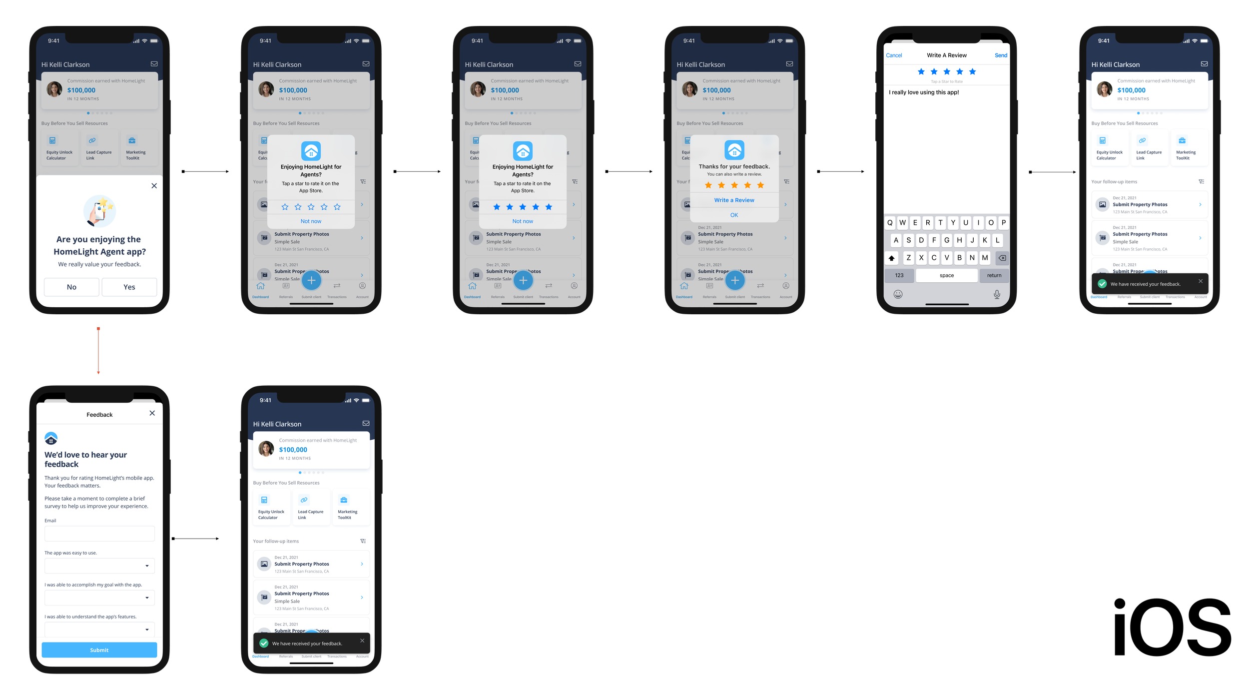
If an agent responds positively to the app review modal, they are directed to the native iOS or Android feedback flow. However, if they respond negatively, they are taken to a HubSpot feedback form, where they are asked five questions about their experience with the app and are given the opportunity to provide additional feedback.
Thumb Style?
In my initial designs, I was keen on using thumbs for the button options and created a few variations to test with users. While the testing was done exclusively on iOS, the examples below show how they would appear on Android for reference.


User Feedback
I conducted three rounds of tests, each displaying a variation of these two choices side by side:
One filled in thumb and two outlined thumbs
Two filled in thumbs, one outlined and one filled thumb
Two outlined thumbs, two filled in thumbs
I asked 10 users, aged from 30-65+, who have worked as a real estate agent, and have previously left a review in an app.
Below are some interesting metrics I gathered:


What’s Next?
Although I received positive feedback on the thumbs, I did some more comparative analyses and noticed other companies incorporate smileys and actual words for their button styles. I decided to design two additional variations which now includes smileys, thumbs up/down, and yes/no choices. I also noticed adding a short sub headline might make the feedback modal more personal and hopefully motivate users to leave a review. Unsure of which option users would prefer, I decided it was time to test the designs in the field… again.


User Feedback Pt. II
Similar to the first round, I conducted two rounds of tests, each displaying a variation of these three choices side by side:
Yes/No, two outlined thumbs, and one sad one happy smiley face
Yes/No, one outlined and one filled thumb, and one sad one happy smiley face
I was pretty surprised by the results!


Results and Takeaways
Here are final results for the button designs:
Yes/No : 7 users.
Two Outlined Thumbs: 1 user.
Smiley/Sad Face: 2 users.
The key insight from user feedback was the impact of the subheadline, “We really value your feedback.” It made users feel that their opinions were important and that they were contributing to something meaningful. This was precisely the outcome I had hoped for when including this subtext.
User Flow
Check out the final user flow for both iOS and Android below!

App Store Refresh
Our previous App Store listing hadn't been updated in two years and featured only three product screenshots, all of which were outdated and no longer reflected the current UI.
Since my focus was to increase the App Store rating and receive new reviews, I thought it was very important to refresh our App Store. I designed new app screenshots and previews for iPhone, iPad, Android, and Google Tablets.
Below are the iPhone screenshots and app previews for the Apple App Store.


Final Results and Metrics
After one week, we saw a HUGE improvement in our App Store reviews!
The App Store went from a 3.2 to a 4.0 rating in just one week! That’s a 25% increase. Today, the App Store is currently at a 4.7 rating and the Google Play Store is at 4.1.
That’s a 47% and 32% increase respectively!
Below is a Periscope dashboard of how I track metrics:

This project was extremely successful and very fun to manage and design from conception to production. Not only did we see a significant increase in reviews, but we are also receiving valuable user feedback that will inform future app updates. I’m collaborating closely with our Support team to ensure that agent feedback is addressed and to maintain our strong relationship with agents.