

HomeLight Ultra - Desktop and Mobile Design
About the Company
HomeLight is a real estate technology platform designed to streamline the home buying and selling process. It connects users with top real estate agents based on their location, providing data-driven recommendations for agents who are best suited to their needs. HomeLight’s platform analyzes millions of transactions to match clients with experienced agents, ensuring optimal results whether they are buying, selling, or both.
Problem
HomeLight wants to allow buyers to search for and pursue homes that are tied to assumable mortgages.
With current interest rates for mortgages at >7%, home buying and selling is at a low that we haven’t seen in decades.
However, mortgages from 2022 and earlier, which were all at <3% interest are actually assumable mortgages for new-buyers. It’s possible to assume the lower interest mortgage from the original holder and as long as interest payments are made on the original mortgage, both parties (seller and assumable mortgage buyer) win.
Role
Product Designer
Users
Home buyers looking to purchase a home that’s more affordable.
Tools Used
Figma and UserTesting.com

Ideation
We initially wanted this to be a subscription-based model where the user would not be able to see the address until they paid a yearly fee. Once paid, the user would be able to view all the low mortgage rate houses in their desired search location.
For the designs, we wanted to highlight these properties on the search page but also blur out the address to try and entice prospective buyers.


User Feedback
I created a user flow to see how easily users navigate from the search page to the property page and eventually get to the subscription pay wall.
We asked 10 users, aged from 30-65+, who have recently contacted a real estate agent in the past six months.
Below are some interesting quotes I gathered:


The Main Takeaway
Contributors found the 4% mortgage rates appealing but expressed skepticism about its feasibility.
Additionally, we held a design review with multiple stakeholders, including the CEO. Some of the main feedback included the size of the property card and making the HomeLight rate pop out more. We also needed to land on a name for the special rate we were offering. I conducted more user research to determine which name resonated with users.
Next Steps
We need to help users understand why the rates are low and to clear up any confusion.
Find a way to make the property cards stand out more.
Change the wording from ‘Featured Deal’ to something that sounds more exclusive.
After much discussion, the company decided to shift away from the subscription-based model and make the program accessible to all.
Design Iterations
Below are the iterated property card designs along with six different name options to replace ‘Featured Deal’. The names I chose were carefully selected to evoke a sense of exclusivity. The card designs no longer have blurred out or hidden addresses since we got rid of the subscription service.
We asked a different set of 10 users with the same criteria as before, to judge which name they liked the best.

Test Results
Here are some of the top comments we received for the names:
Ultra-Low Rate : Setting an even lower rate than others, lowest.
Exclusive Rate: Special, tailor made for you, VIP, refined, membership, private.
Hot Rate: Feels exclusive, personalized, sense of urgency.
Hot Deal: Sounds confusing, sounds like it’s on sale.
And the winner is…

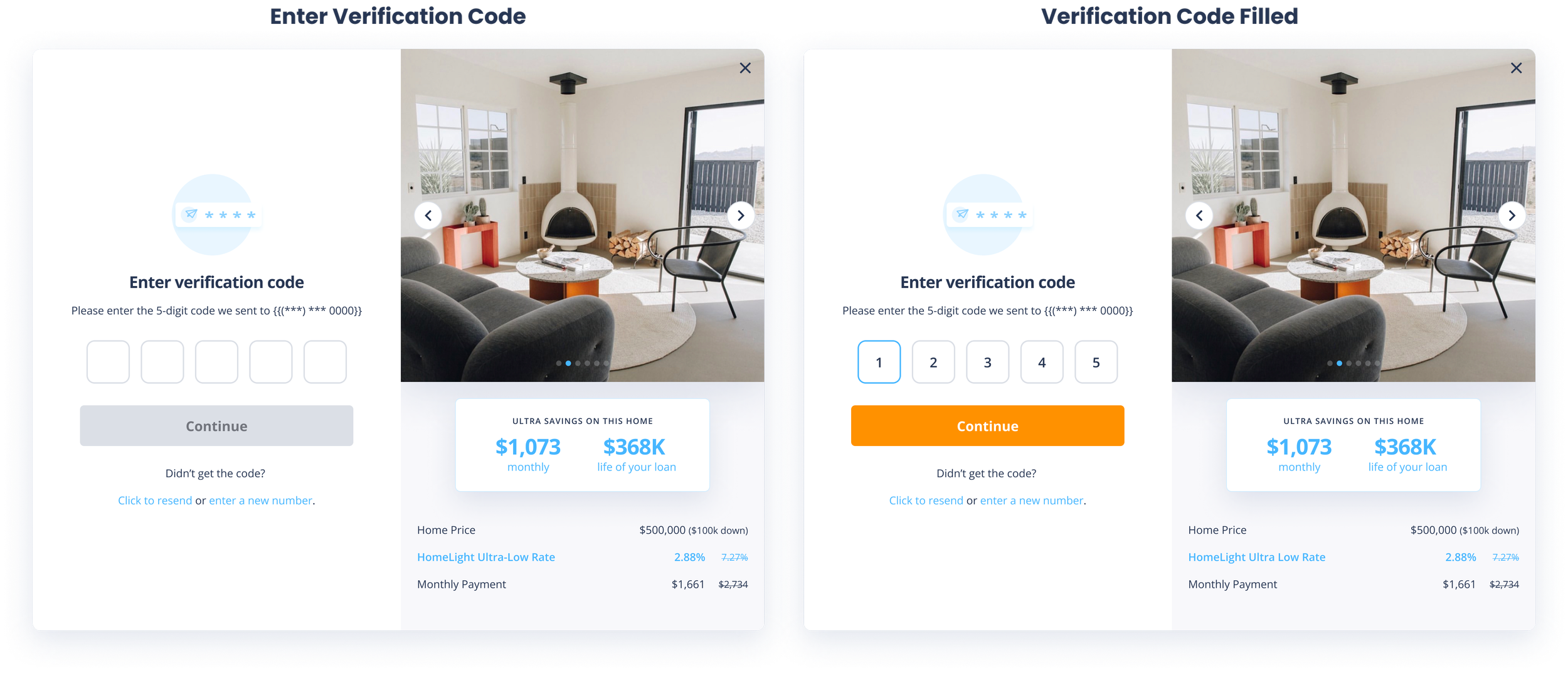
Below are the iterated property card designs based on the feedback I received along with call outs to help clarify the Ultra-Low rate program.


Results and Final Thoughts
This project was both exciting and challenging, requiring extensive user research, numerous design iterations, and constant collaboration with key stakeholders. We uncovered that users found the program confusing and the rates seemed “too good to be true,” which created skepticism. Additionally, we needed to develop a name for the program that aligned with the brand and was marketable.
To address these challenges, we designed clean and intuitive property cards with strategic callouts, making the program easy to understand and ensuring clarity throughout the user journey. As a result, the program has received positive feedback and successfully facilitated multiple transactions!
