Knac: A B2B Data-Driven Platform Integrated With ATS for Recruiters

Background
Knac was founded by Ariel Lopez, who has a deep understanding of the pain points job-seekers have today. She created Knac, a data-driven talent evaluation platform, that helps job-seekers not get ghosted. Nearly 85% of resumes are ignored due to the overwhelming volume of applications most companies receive. The product enables recruiters to automatically screen 100% of applicant resumes to remove bias and increase the visibility of all candidates. In addition, the intake process vets companies against an internal scorecard in order to rank them for job-seekers.
View Final Prototype

Overview
Timeline: 3 Weeks
Interface: Web
Intended Users: Recruiters
Tools: Figma, Miro, Sketch, Trello
Team:
Carmelle- Design Lead
June- Project Manager
Kiambu- Research
Konni- Research Lead
The Challenge
Knac, a B2B company, wanted an upgraded version of their current product, that incorporates some new and/or removed features to use as a demo for potential customers and investors. They wanted to explore how to send meaningful correspondence with actionable feedback from the platform to job-seekers.
The Goal
Redesign and update the current product to acquire new clients and streamline the recruiting process in order to increase efficiency and remove bias.

What Was Wrong with the Current Dashboard?
The current dashboard lacked efficiency and generated more questions than answers. The pages did not feature any explanations nor did it contain site navigation, leaving users unsure of where they are in the process. In terms of the UI, the Knac branding was non-existent and many buttons and elements were oddly placed and had no flow; there was no clear hierarchy of information either.


1. The pages solely display data and no explanation of what needs to be done on that page
-Add explanations to pages to inform user of what needs to be done
2. Buttons are awkwardly placed
-Reconfigure button placements
3. There is no site navigation to inform the user of where they are in the process
-Include breadcrumbs to ensure a streamlined hiring process for recruiters
4. The UI and visuals do not align with the Knac brand
- Update the entire look and feel of the dashboard
Checking Out the Competition

Personable and transparent dashboard with a seamless workspace

Integration with external platforms

Straightforward onboarding experience

The dashboard has a well-established hierarchical organization and each applicant has concise information visible on their profile

Share candidate profile with others

Explore recommended matches to quickly find the right talent
Talking with Recruiters

Key Takeaways from User Interviews
1. Assess candidates fairly
2. See more personalization from applicants
3. Understand diversity metrics
4. Prefer using software with low switching costs
5. Want a simple process without too many options
These synthesized findings lead us to determine the main issue our recruiters face
The Problem
Recruiters need a faster way to evaluate talent, so that they can maximize the limited time they have to review thousands of applicants.
Who’s Our User?

Heather’s Current Routine
To understand Heather’s pain points, we created a user journey map to pinpoint the pain points she encounters during specific events.
The majority of her day is pretty stressful from feeling overwhelmed by the amount of applicants she needs to filter through for each job; she also needs to schedule and follow-up with every applicant. We also found how frustrating it can be for recruiters to move forward with applicants since many tend to ghost during the hiring process.

A Little Dash(board) of Inspiration
After consolidating on the main problem and converging our research, it was time to gather inspiration and begin building the recruiters’ dashboard.
We decided on placing the global navigation on the left side of the screen to provide ample space for the crucial features recruiters need to efficiently work.


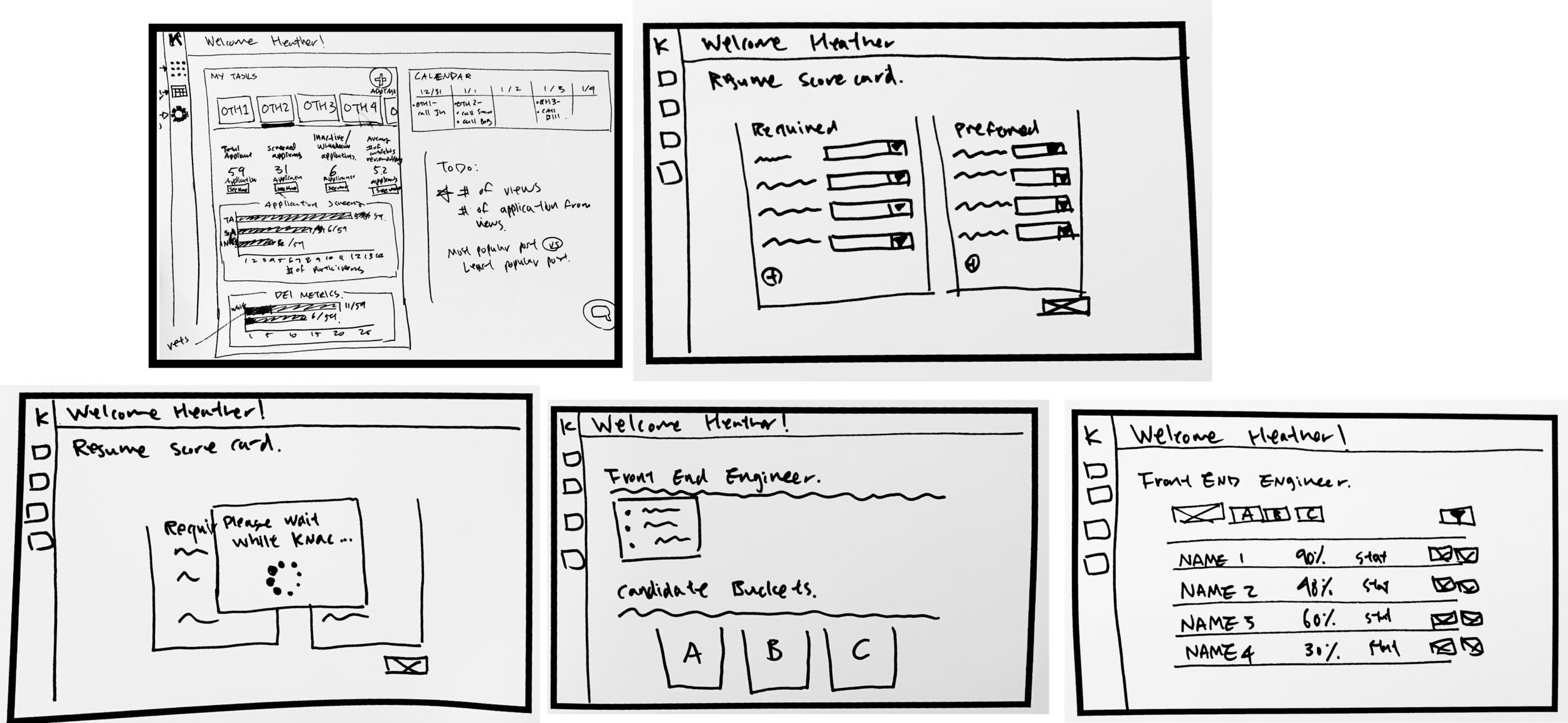
Sketching the Low-Fi
My team and I got to work sketching a few different screens by incorporating a design session. We wanted to design a space for our users to efficiently and quickly finish their tasks as well as visually see various metrics and assignments that need to be completed.
The most valuable addition we wanted to include in the new design were instructions for each page so that recruiters would understand and feel in control of their new dashboard.
After agreeing upon a design, it was time to move onto digitizing the paper sketches and take our prototype out to the field.

We were able to recruit three recruiters and conduct usability tests to figure out the pain points and to better understand how our future users would interact with our prototype.
The three tasks included were :
1. Creating a new scorecard
2. Adding weight to each skill
3. Viewing the “A” candidates

The Main Takeaways
The three users were able to quickly complete the first task but got too excited and started adjusting the weight for each skill, which was the second task. Viewing the A candidates also deemed simple, which reassured us that our design had an easy flow.
After the tasks were completed, some of the recruiters noticed some features and buttons on our prototype that raised a few red flags.


Time to Iterate
These valuable insights made us excited to iterate and start adding some color to the grayscale prototype.
Here, we have version 1 of our high-fidelity prototype. We wanted to emphasize the graph so our users can quickly glance, screenshot, or share their pipeline progress with their managers.


“Not the Vision We Were Going For…”
After presenting our designs to the client, they did not resonate well with the UI of the dashboard.
We were given the updated style guide of their newly designed website one business day before the project deadline and we quickly got to work.
Aligning Styles

Here is the updated style guide Knac provided us to ensure their dashboard resonates with the website design
New Look, Who Dis?
After the client meeting, it was time to go back to the drawing board and update the UI on the current dashboard. Using Knac’s style guide, it was “go-time”.


The green side navigation bar was replaced with a subtle gray gradient, the dashboard has pops of purple, and various geometrical elements found on their website

We presented the updated designs to the client and she was highly impressed by our diligence and promise to deliver a product that represents Knac to the highest standard.
View the final prototype