

Netflix
Mobile App Feature Concept
Overview
Netflix is an American subscription-based streaming service that has been experiencing a monumental surge with users due to the pandemic, 72% increase in average weekly usage to be exact. However, Netflix has been canceling shows early due to their fear of those shows underperforming.
Me and my team were challenged to reconfigure the current platform to increase viewership with any underperforming content.
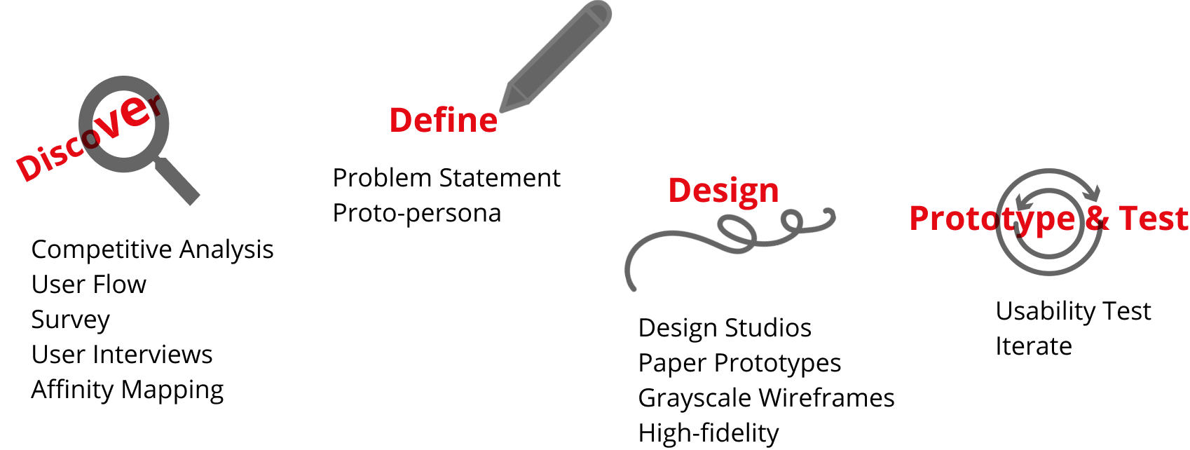
Timeline: 2 week sprint
Team: Carmelle, Chris, Elena, Leo
Tools: Figma, Marvel App, Miro, and Sketch
Platform: Native mobile app
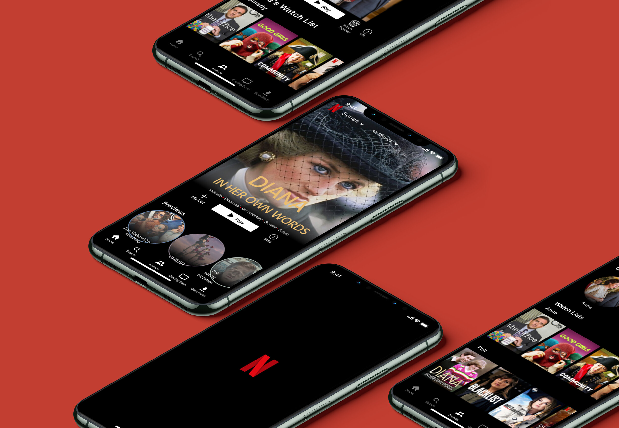
Final Product

The Main Problem
Netflix Original Shows are underperforming. Netflix has been canceling shows early due to their fears of those shows underperforming. Due to the pandemic, their user needs’ and expectations have changed and they want their app to adapt accordingly. They believe adding social features will help increase viewership with any underperforming content.
A Little Dose of Healthy Competition


Getting to Know our Users
My team and I created a survey to recruit our target users. Upon talking to these Netflix enthusiasts, we quickly realized they felt trapped within Netflix’s algorithm and were not exposed to the vast content the platform offered.

User Criteria
Movie & Show Enthusiasts
Our users were recruited based on the amount of hours they watch Netflix
Avid Social Media Users
Each user uses social media about 3.4 times/day
Young Adults
Our users ranged from ages 24-30

Get Me Out of This Bubble!
After spending a few hours organizing and synthesizing the data from the interviews, it became clear to us that our users didn’t feel exposed to all the content Netflix has to offer. In addition, they also enjoyed discussing and recommending shows with their peers.
The Revised Problem: Viewers Want to be Exposed
Users need a way to discover and share new shows with friends so that they can break out of their current viewing bubble.

Let’s Get to Swiping
Our team conducted a design session to ideate some potential features to help Max solve his problem. We decided to create a “My Pod” page where users can view their friends’ Watch Lists. In addition, we implemented a swiping gesture, that would enable users to quickly and easily find new shows and/or movies.
The swiping feature is an algorithm that basically takes your friends’ shows and aggregates them into a shuffled pile.
Once we established a clear direction, we allotted 30 minute time-blocks for design studios.
Pictured, we have low-fidelity sketches that incorporate the new Flix Swipe feature as well as the “My Pod” page. We took these out to the field but found some major issues...

1. Users didn’t understand why there were two separate sections with circles in the “My Pod” page
2. The users were asked to add a movie to their list but immediately went to the plus sign on the top right, and were taken to the “Add Friends” screen.
3. Users were overall confused and found the homepage overwhelming. They were also unsure of how to add movies to their lists based on what their friends were watching.
4. The Flix Swipe feature was also too small
We Empathized With Our Users and Tried Again
These tests highlighted many issues with our design but that motivated us even more. We took out the top row of circles which were the current shows a user’s friends were watching, enlarged Flix Swipe, and changed the “Friend’s Lists” to “Watch Lists”.

“’My Pod’ sounds like a place to watch movies with friends...”
Users were confused with what the “My Pod” feature was and didn’t think it resonated well with the concept we were striving for which was to have a page to explore content your friends are watching.
People didn’t quite understand what the Flix Swipe feature was so we decided to take out the navigation bar and make the entire screen a short clip. We hoped this change would clarify that users need to swipe left and right.

Despite All These Changes, Users Were Still Confused With Flix Swipe
“How do I get out of here? I feel trapped!”
Upon conducting the user testing for the high- fidelity, users liked the concept of Flix Swipe, but just did NOT understand how to use it. One user even bypassed the entire feature!

Our Users Like Feeling a Sense of Connection During These Difficult Times
To focus on the MVP, the “Friend” page was an ideal place to elaborate and develop more, so FlixSwipe was taken out. This change was critical since our users were confused with the feature but wanted a place to collaborate and share content with friends.
We needed to create a clear and intuitive way to introduce this new feature into the app.
“Bringing people together during times of quarantine”


Reflection
This project was incredibly challenging, fun, and eye-opening. We learned the value of the MVP and how the vision we had for our app based on our users could be changed drastically after rounds of tests.
We solved the issue of users feeling stuck in a bubble by designing a page dedicated to viewing what their friends are watching which helps them discover new shows that might not be in their algorithm.
For next steps, we would want to conduct more usability tests and iterate to ensure these new changes bring ease and a sense of togetherness to our users during these difficult times.